Responsive Web Design: Should you Go For It?
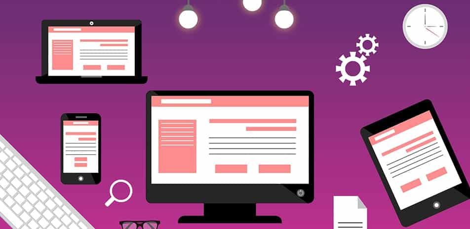
Responsive web design, commonly abbreviated as RWD, is a set of techniques and ideas that aim to make a web page fluid and self-adjustable to improve the user experience through easier reading and navigation. Technology is gaining momentum because of the increasing number of mobile devices like tablets, laptops, and mobile phones, all of which have different sizes and shapes of screens. Due to its flexibility and adaptability, responsive design has grown extremely popular with mobile web designers.
In May 2010, Ethan Marcotte published his important work on RWD1. Within the article, he elaborates on the set of ideas and concepts behind his creation, saying that it is not a singular technology but rather something to fit in the general digital landscape. Before him, “Mobile First” and “Progressive Enhancement” dominated the web design field. These strategies included building an extremely basic mobile site for the oldest technologies, and then gradually scaling it for more advanced devices.
Technically speaking, RWD utilizes CSS3 media queries to change the layout of the page via percentage based (compared to point and pixel-based) grids2. These media grids allow the website to interact with the device and take into account specifics like the browser width and height for a customized user experience. Images are further resized into relative units (either EMs or percentages) so they do not reach outside their containing elements.
The first step to responsive web design goes through fluid grids, which are based on proportions. Using a good image-editing tool, you can check what proportion of the page an element takes up; for example 30%, and apply that to its positioning. Keep in mind that more precision will lead to a better-looking page. Naturally, this resizing will look fine to some point, beyond which the elements will become too narrow; consider small phone screens. The CSS3 media queries allow for different CSS styles to be applied in different browser-width intervals. For instance, between 320 pixels and 480 pixels, only the basic core text is displayed, while between 480 pixels and 600 pixels, an extra menu shows up.
Naturally, this technology is not without drawbacks. The biggest one is load time. While a normal fixed layout site loads the same information repeatedly, a responsive one must tailor it to the different devices, which makes it a couple of times slower. Furthermore, responsive web design would mean that the same content and similar experience are transferred to different devices. This might not be appropriate for, say, mobile commerce and mobile shopping, where users prefer quick access and do not use the search function. Tablets and mobile phones are used on the go for checking movie prices and reviews, so comprehensive film information will be unnecessary.
This, however, should not be interpreted as “consistency is bad”. On the contrary, a key element in branding is maintaining the same feel and look of your interface. It makes using the website much easier for daily visitors and makes the transition from desktop computers to mobile devices more seamless.
Unfortunately, responsive web design only solves one of many problems: the resizing of the page interface. Certain desktop features, such as hover-over menus, cannot be translated to a touch-screen device. RWD helps companies provide a good substitute for a full-fledged, dedicated mobile website when their resources do not allow for one.
To answer the question from the topic, responsive design is perfect for companies that do not have the budget to invest in mobile websites but still want to take advantage of the increasing number of mobile users. Their websites must be relatively simple with few desktop-specific features, and their content should be relevant to all situations.
References:

